Understanding Context: Environment, Language, and Information Architecture (2014)
Part IV. Digital Information
Chapter 13. Digital Interaction
I don’t design stuff for myself. I’m a toolmaker. I design things that other people want to use.
—ROBERT MOOG
Interfaces and Humans
WHEN WE INTERFACE WITH DIGITAL SYSTEMS, we’re doing so through many layers of abstraction, so it’s necessary to provide environmental elements that we can recognize and understand. That’s essentially what computer interfaces are: artificial environments that bridge the gap between digital information’s total symbolic abstraction and our perceptual systems’ need for affordance, whether physical or simulated.
It’s easy to forget that the word “interface” isn’t necessarily about people. For many years, the word mainly had to do with how one machine interoperates with another. For example, an API is an application programming interface with which software engineers can make two applications share functions and data; and the acronym SCSI means Small Computer System Interface—a hardware standard for connecting devices and peripherals such as hard drives and personal computers (see Figure 13-1, left). Like most things related to digital systems, software and hardware interfaces work best when they are rigorously defined and kept to an efficient minimum, such as with a keyboard (Figure 13-1, right) or mouse. Overlapping, extraneous, or ambiguously defined interfaces are anathema to efficient, reliable digital system design.
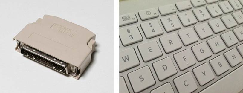
Figure 13-1. Left: A “terminator” for a Small Computer System Interface, or SCSI (pronounced “scuzzy”), device chain;[263] right: a keyboard for the structured-language input from human fingers[264]
Both of these are hardware interfaces for sharing data between two systems. But in the keyboard’s case, one of the systems is human. As we’ve seen, humans perceive and act in ways that are abundantly ambiguous and overlapping; we satisfice our way through our activities, and only tacitly and passively comprehend most of what we encounter. That is, humans are horribly inefficient, irrational systems. In spite of this fact, it’s perhaps ironic that software-making organizations expend so much time on digital-to-digital interfaces, and so little on the interface between the digital system and the human, who is by far the most challenging, complicated system in the mix.
At their best, digital systems accommodate our physical and semantic informational needs quite nicely; at their worst, they require us to think and behave like computers, which is hard work for us squishy-brained animals. It’s in this translation between digital and physical/semantic modes where we find the seemingly infinite varieties of architectural and design challenges that sparked the need for new fields of practice, like human-computer interaction, usability engineering, interaction design, information architecture, and others.
In only about 50 years, digital interfaces have gone through a rapid evolution, from an age of punch-card-driven mainframes to our current plethora of input methods that use high-resolution graphics, virtual keyboards, voice recognition, and motion-tracking sensors. There are other resources beyond this book for exploring all the varieties of human-computer interfaces and models of interaction with digital systems. Although we will touch on some specific interaction examples, our purpose here is a bit broader: to establish that interfaces are part of the environment we inhabit and are themselves smaller environments nested within the larger ecological context.
For a generation, software was made mainly for trained specialists in rarified environments, performing highly structured tasks. Now that most software is being made for regular people doing everyday stuff, software has to be reframed as everyday environment that laypeople expect to use as they do everything else around them—mailboxes, toasters, elevators, and bridges. This is the place of most software now—devices in the world that need to just work, without a lot of fuss.
Moreover, when we create digital agents, we have to do the extra work of translating between their black-box nature and the cognition of regular people. Most of this translation is done by using language.
Sometimes we get pretty close to success, but not close enough—as is demonstrated in the example of a common gas pump. Gas pumps use digital information to handle transactions between the pump, the store, and credit-card processing services. They’re simple digital agents, but they are agents nonetheless—making decisions based on established rules in their software. When I tried pumping gas recently, I’m embarrassed to admit it took me a full minute to realize there was a sticker above the digital display (Figure 13-2) translating the passive-aggressive computer’s demand that I “ENTER DATA.” In such mundane examples, pervasively spread across our environment, every detail matters in shaping contextual clarity.
It bears repeating—especially for digital technology—that there is no such thing as a purely natural interface. Any digital system requires learning (or relying on learned convention) for an artificial user interface of some kind, because there will always be the need to translate the abstraction of digital information into invariants that users can comprehend, whether simple buttons, voice commands, mere labels, or sensor-triggered gestures.

Figure 13-2. A common workaround for talking with the digital agents among us[265]
Semantic Function of Simulated Objects
For most of human existence, an object was either an object or it wasn’t. A picture of an object only represented something; it afforded seeing light of varying shades of color but not taking action with the object depicted.
In a famous example of this distinction, René Magritte’s painting The Treachery of Images shows a tobacco pipe. Its caption says: “Ceci n’est pas une pipe.” Or, in English, “This is not a pipe.” It’s a popular example for talking about signs, symbols, language, and all manner of fascinating semiotics issues. In our case, it helps make a point about representation in digital systems.
Magritte’s picture of a pipe is, indeed, not actually a pipe. But how do we know? In part, because our perception-action loop can tell that it’s just a picture: it’s contained on a flat surface; it’s a realistic depiction, but not nearly enough to be construed as a photograph; and it has a caption written underneath it, on the same surface plane.
The final test: the viewer’s body can’t actually pick it up, put tobacco in it, and smoke from it. That is, what makes it not a pipe is largely its lack of pipe-related affordances.
![Magritte’s The Treachery of Images (© Herscovici, Brussels/Artists Rights Society [ARS], <a href=](context.files/image077.jpg) New York)" width="300" height="210" />
New York)" width="300" height="210" />
Figure 13-3. Magritte’s The Treachery of Images (© Herscovici, Brussels/Artists Rights Society [ARS], New York)
And yet, the caption strikes the new viewer as strange. “Well, of course it’s a pipe, what does he mean?” The conceit of Magritte’s painting works because we don’t go around separating semantic and physical information every day. We often use them as if they were interchangeable. As in the duck-rabbit example in Chapter 12, this pipe is something about which we normally say, “That’s a pipe,” rather than “That’s a painting that depicts the physical aspects of an object with affordances that are related to a category of objects we call ‘pipe’.” We’d get very little done in the human world if we had to talk that way.
Digital technology has the ability to take this natural tendency toward conflation and use it to simulate physical objects and their behaviors. I can’t smoke this pipe, but on a digital device’s screen, I can “press” a pixel-rendered picture of a “button” to make the system do something. It’s not a physical button, but within the rules of a digitally enabled interface, it might as well be. It’s a picture of a pipe, but one I can smoke. It presents semantic information on a display in such as way as to behave as if it were a physical object. In other words, this is semantic function, simulating physical affordance.
An example of a big button lots of people use is in the Shazam mobile app; the app’s main purpose is to help users figure out what songs are playing, wherever they happen to be. To do that, it presents a simulated-affording structure—a picture that looks like a button, as depicted inFigure 13-4. The drop-shadow and slight gradient make it appear like a raised, convex object, similar to many other physical buttons we encounter in our surroundings. Of course, Shazam also adds a bit of text helping to nudge the user toward understanding that this is not merely a decorative picture, but an interactive object. Interestingly, if you touch anywhere on the screen other than the button, nothing happens. The button is only a picture, but it presents itself as a physical object that demands we aim specifically for it—a way for this digital agent to make an educated guess that we want it to listen to a song.
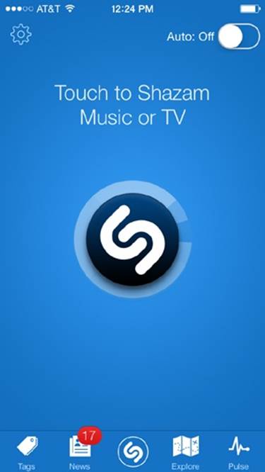
Figure 13-4. The Shazam mobile app’s primary control is a big simulated button that, when touched, scans the environment for musical patterns
An on-screen button is just one way semantic information can simulate physical affordances, making them “interactive”—a word that wasn’t in prevalent use until the 1970s and 80s, when technology enabled previously inert parts of our environment to become things that, when we poked them, starting poking us back.
Interaction, and the design of interactions, largely originated with the emergence of electronic devices. And digital technology enabled those devices to richly simulate interfaces in ways that physical buttons on electrical gadgets couldn’t achieve.
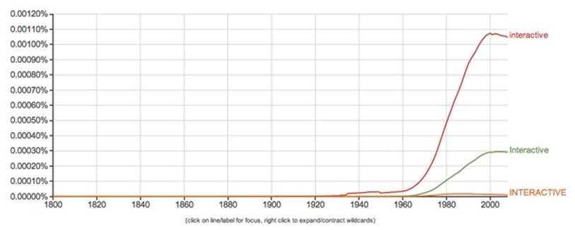
Figure 13-5. Google’s Ngram Viewer shows usage of “interactive” climbing fast along with the rise of computing interfaces
Now, we have very complex interfaces full of many nested layers of objects. There are debates as to how closely to their physical counterparts these objects and their controls should be rendered. On one side of the spectrum, there’s the skeuomorphic approach, which presents a literal translation of the physical surfaces and objects we encounter in the physical world. Sometimes, that copying can be gratuitous and unnecessary. Other times, it’s important to re-create the physicality of analog objects, to provide familiar clues into learning the system’s simulated affordances.
For example, with the Animoog app, users can play with an interface simulating an old Moog synthesizer—a culturally significant device whose form is a big part of the experience of using it. Abstracting those wonderfully retro controls (see Figure 13-6) into something less literal would disrupt the entire purpose of playing a simulated Moog. And yet, because the knobs are not physical, there is no “twist” gesture that feels like using real knobs. Instead, the interface relies on an up/down finger “scrub” gesture to make the setting go higher or lower. Simulation on glass digital screens can go only so far.
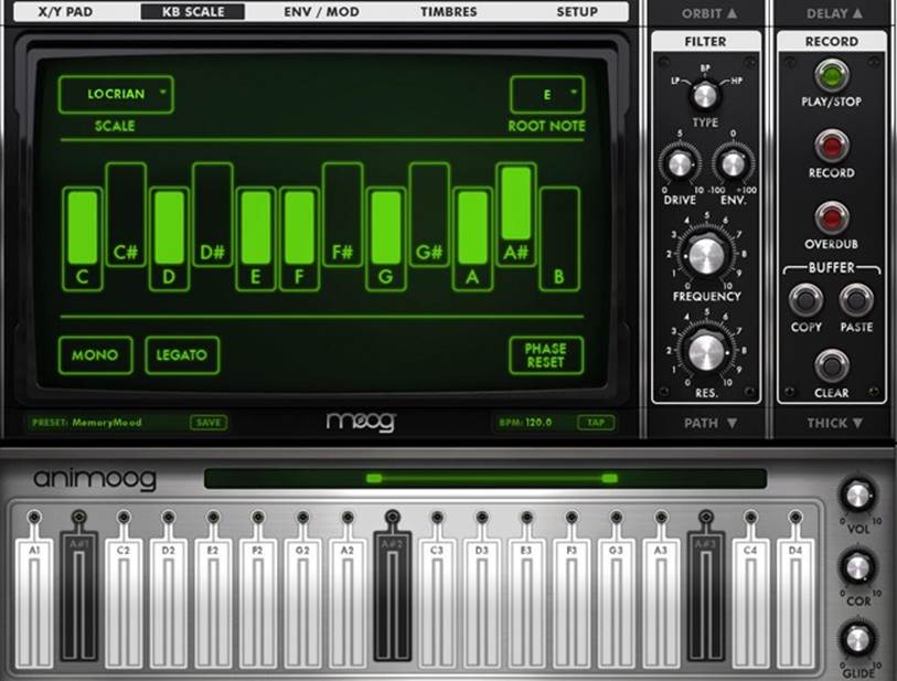
Figure 13-6. Animoog simulates the controls of a small Moog synthesizer
In recent years, there’s been a raging debate in the design community about skeuomorphic versus flat design. The watershed moment was Apple’s release of iOS 7, which went far into the direction of these so-called flat interface surfaces and objects.
Unfortunately, this polarity is misleading, because these are not a binary choice; the design approaches are on more of a spectrum. In Figure 13-7, which compares iOS 6 to iOS 7, notice the big difference between the Cancel and Send signifiers. Both versions simulate the same action, but iOS 7 has eschewed the faux-convex-recessed-button treatment. The reason why Apple is able to remove the button simulation is because most users have learned, through repeated exposure and growing convention, that the words “Cancel” and “Send,” in this situated context, are action verbs that signify their respective functions. Outside of this context, these words could convey many other messages, but in software this sort of placement has an established, near-invariant meaning.

Figure 13-7. The Apple iOS 6 interface (left) compared to iOS 7 (right)
But notice that the Add button with the “+” symbol has a circle around it, giving a clear boundary that makes it more a button than the “+” character alone would do. Evidently, designers at Apple realized that the “+” wasn’t enough by itself. Also note how iOS 7 adds a camera icon, making it possible for users to more quickly send a picture when messaging. It doesn’t have three-dimensional gradients, but it’s definitely an iconic signifier, mimicking the shape of a physical object, which is probably a better, more compact signifier than “Add Picture.” Of course, given the changing form of photography devices, the conventional camera icon might soon become an anachronism, the way the floppy-disc icon (for “Save”) has become today. Culture and language infuse all interfaces, where ingredients mix into semiotic stews of semantic interaction.
Interestingly, many users were having trouble with the new label-only controls, so Apple added an “Accessibility” option to turn on “Button Shapes,” like the gray button-like shape shown in Figure 13-8. It clarifies the simulated affordance by subtly mimicking the physical information we associate with mechanical buttons.

Figure 13-8. An option in iOS 7 adds button shapes
Part of what this illustrates is that the context of what a simulated control does and how our bodies should interact with it, is fundamentally a linguistic question. Why? Because the information on the screen is all semantic in one way or another; it’s either simulating objects, or presenting text for reading. It’s using signifiers that are “drawn” on a surface. Whether a label or shape does enough work to signify its function is a matter of learned environmental convention, just like the meaning of words and sentences. Digital information is behind this transformation of our environment, and therefore the transformation of our users’ contextual experience.
In the examples presented in Figure 13-9, we see a sort of spectrum of how objects use invariants to inform our behavior, from physical to semantic.

Figure 13-9. A range of physical to semantic invariant cues[266]
Here are the significant characteristics of each object (from left to right):
§ The stairs are directly perceived by our bodies as affording upward motion. Their affordance is intrinsic to their invariant structure, nested within a building, nested within a city. And in keeping with the multifaceted way we perceive nestedness, the stairs’ “meaning” to our bodies changes when we want to go down them or sit on one to look at a book for a moment.
§ The Engine Start button also has intrinsic structure that, with experience, we’ve learned means it’s an object that can be pressed into its surrounding surface. But that’s as far as the intrinsic, physical affordance goes here. Without pressing it, we don’t know what pressing this button ultimately does, unless we read the label—a signifier with semantic function, supplementing the object, informing us how this object is actually nested within a broader system that is otherwise invisible to us.
§ The old version of the Windows Start button is similar to the Engine Start button in every way, except that it isn’t a physical button (and in this case, not one we touch with our fingers). It’s using graphical information to simulate the contours of conventional, physical buttons. It’s also connected to a vastly more complex environment than what we find in even the newest automotive ignition systems.
§ Last, we have a hyperlink on a bookstore’s website. Just as we would use for the Windows Start button, there’s a cartoon hand icon that functions as an avatar for the user’s own hand (that is, linguistically, it’s behaving as an actual iconic signifier), indicating (that is, acting also as anindexical signifier) where a click of a mouse will engage the digital surface. That surface has other signifiers on it—the words in the menu. These words equate to buttons because of learned conventions, such as the fact that a web layout with a list of words placed around the edges of the interface is most often a menu meant for navigating that environment. It may also use a convention of color-change when the user’s hand-avatar (cursor) hovers over the label, as it does here. The same words elsewhere—outside a context that aligns with the menu layout convention—might not be recognized as hyperlinks. Labels used as links put a lot of pressure on the semantic context of the label, to signify not only its interactive nature, but also where it will take us or what it will do when we tap or click it.
This isn’t a comprehensive spectrum; it just shows how information can range from the simply intrinsic physical to the highly abstract semantic. Designing such objects based mainly on concerns of aesthetics and style runs the risk of ignoring the most important challenges of simulating affordance through semantic function.
Unlike our interactions with physical objects, such as opening a kitchen drawer or swinging a hammer, we never directly control what software does; it’s always mediated through layers of abstraction. The illusion of touching a thing in software and seeing it respond to our touch is a construct of semantic function, not a direct physical affordance. So, the cause-and-effect rules of software aren’t perceivable the way we can see the action-and-reaction of physical objects and events, and they’re not readable the way semantic rules are expressed in documents. We tap a button labeled X and hope the system will do X; what happens behind the scenes—how is X is defined, and does X also mean Y and Z—is up to the system.
Email serves as a good example of how semantic function can approach but not quite touch the physical affordances of actual objects and surfaces. As James J. Gibson argued, a mailbox is really a complex, compound invariant. Its function provides for more than just putting an object into another object—we perceive it as part of a cultural system of postal mail, so its function is to send a letter to an addressee. But perceiving that function depends on having learned a great deal about one’s cultural environment and what one can expect of it.
Digital technology takes the physical affordances of how mailboxes and mail work and fully abstracts them into something made entirely of language—rule-based functions presented as metaphorical labels and iconography. Email has an “inbox” and “outbox,” but there are no physical boxes. Not unlike the way digital clocks have virtually replaced the intricacies of clockwork-driven timepieces, email dissolves formerly complex physical systems into the abstractions of software.
Email gives us valuable abilities that we didn’t have before, but it also loses some of the qualities we enjoy by working with physical mail objects. Especially now that we’re so overwhelmed with the stuff, some innovators are trying to reintroduce a bit of physicality to the work of managing our email.
In 2012, America Online (AOL) started rolling out Alto, a new email platform (Figure 13-10). One of the principles behind its design is something called stacks that design lead Bill Wetherell says were inspired by noticing how his wife sorted physical mail from the post office:
§ She would separate it into piles based on the type of mail it was, such as catalogues, correspondence, coupons, and bills.
§ She’d place each pile in a part of the home where it was most relevant and likely to be used for its main purpose (coupons in the kitchen, for example).
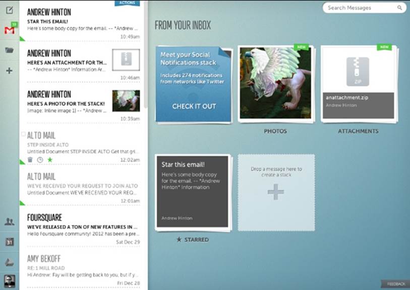
Figure 13-10. A sample of the simulated physical-stack approach for the Alto email platform
This is a textbook example of extended cognition: making use of the environment not just for sorting the mail, but arranging those objects within the home environment in such a way that they afford further action for managing their contents.
Wetherell says, “We started to wonder if we could re-create that same physical process but in the digital world.” So, Alto presents—as one of the main interaction modes—graphically simulated stacks of mail. It also tries to sniff out what stack incoming email should go to so that the application can handle a lot of that piling for the user.[267]
There are some interesting challenges in trying to replicate these physical behaviors within an email application.
Recognizing the difference between real mail and junk mail
We’re pretty good at quickly sizing up what sort of postal-service-delivered mail we’re holding in our hands, because the physical qualities of the objects provide a lot of physical information to work from. Catalogs are heftier than personal letters or retail flyers. Envelopes are obviously handwritten versus bulk-printed.
In email, all those physical cues disappear, and we’re left with the representational semantic information deliverable by SMTP servers and readable by email software. This not only makes it harder to recognize what each incoming item really is by just seeing it in our inbox, but also provides even fewer cues for quickly sizing up each piece of mail. This is one reason why Alto tries to sort the mail behind the scenes: a software algorithm can actually be more literate in the digital-information-based cues of digital mail than people can.
Stacking is cognition
In stacking physical mail, we touch each piece and think about it just enough to do some prework with it—a crucial part of the cognitive work we do with physical objects, especially when organizing them for later action. I know that when I’ve done this, it helps me to remember what’s in each stack even days later, without having to go through each item in the stack again. By having the system automatically sort the stacks behind the scenes, the user misses this opportunity.
Stacks in physical places
As mentioned earlier, Wetherell observed that his wife would place the mail in various parts of the house, where they were more likely to be processed later, related to their larger corresponding physical tasks. That is, these stacks are nested within other environmental structures and physical activities. A digital interface interrupts this house-as-categorizer function. Of course, it’s possible our homes could eventually be pervasively digitized—with bedside tables and countertops where we can “put” stacks of our sorted, simulated mail. But that’s probably more complicated than it’s worth.
These are certainly not criticisms of Alto, which is to be applauded for tackling the challenges of improving how we use email. Alto is just a useful example of how a digital interface can go only so far in replicating the cognition-extending affordances of the physical environment. Allowing the user to work with simulated stacks is a worthwhile experiment. Think of how useful this capability would be in any search interface, for example, where you could pile and mark items the way college students can do in a library’s carrels and stacks.
Modes and Meaning
For interface design, a “mode” is a condition that changes the result that the same action would have under a different condition. Complex machines and digital devices often have modes so that users can accomplish more things with the same number of controls. Modes are important to context because they establish rules of cause and effect for user action. They literally change the context of an object, or even a place.
A simple example of this is the Caps Lock key on a typewriter or computer keyboard, similar to the one depicted in Figure 13-11. When it’s engaged, it remains in a mode that makes all the keys create capital versions of their corresponding letters; when it’s disengaged, it goes back to lowercase letter typing. We make mistakes with this mode all the time, so much so that software password fields often remind us after a few tries that we have our caps lock engaged, which might be causing password failure.
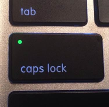
Figure 13-11. A MacBook Caps Lock key, with its “mode on” indicator lit
Mode is a big challenge when designing understandable contexts. As technology becomes more complex, we ask a limited number of affording objects (keys, buttons, and so on) to do more kinds of work. In early word processors, pressing a particular key would cause the keyboard to change from a text input device to a text formatting or file management device. It worked like the Caps Lock key but affected a more radical shift of function. This sort of mode is known as sticky—it persists after you engage it.
Non-sticky-mode keys require being held down while using their mode, like the Alt or Control keys on personal computers. So, pressing only an S key while editing a document types the letter “s,” but pressing and holding Control while typing S (in Windows) saves the document.
Sometimes, the application you’re running changes what your keyboard’s keys do entirely. Many computer games use the A, S, D, and W keys for moving a character through a game environment, corresponding to left, back, right, and forward, respectively—until a “chat” mode is activated, in which case typing displays letters and numbers, as usual.
When users are aware of modes and motivated to learn them, the negative effects can be minimal. However, when users are not aware of the mode, or their “muscle memory” causes them to take an action for effect A because, in the moment, they forgot the system’s control was engaged for effect B, the results can range from annoying to disastrous. I was recently using a rental car that had a new, interactive dashboard system. It was a horrible mess of confused signifiers and functions, in which controls that are usually physical knobs or buttons were subsumed by multilevel, menu-driven interfaces. That’s not such a big deal if you’re doing something infrequent and complicated such as syncing your phone to the car’s Bluetooth system. But in this case, the car required me to interact with several layers of buttons just to switch between ventilation modes.
I’ve been driving for many years, so I’m used to controlling heat output with a quick twist of a knob or tap of an obvious button. Because auto temperature can change quickly on a trip, depending on the sun and other factors, it’s one of those things I prefer to have “ready-to-hand” (as discussed in Chapter 6). In this rental car, however, the controls were more “unready-to-hand.” It took at least four different interactions—all while staring at the system and not the road—to not only switch the screen into the Climate mode, but then select the mode of climate control I wished to use. And after all that, as Figure 13-12 shows, I then had to confirm my selection by pressing Done. Modes nested within modes within modes—something that could be truly dangerous while in motion.
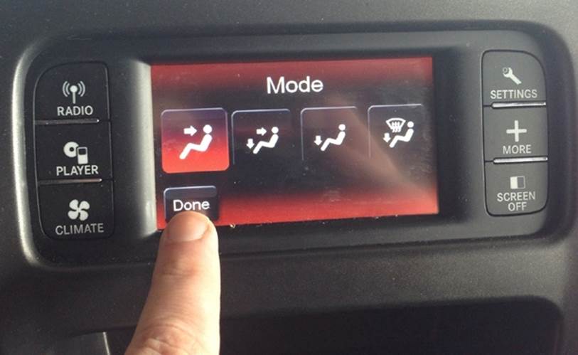
Figure 13-12. Poking at a confusing modal interface (photo by author)
Design leaders have argued against using poorly implemented modes almost since consumer software was invented. Donald Norman was writing about them as early as 1981.[268] And interaction design pioneer Jef Raskin infamously railed against using any sort of mode-based inputs, because they almost always result in problems.[269] (He actually preferred the Control-key sort of mode that required a continuous action, calling them “quasimodes.”) Even Raskin’s son, designer Aza Raskin, has continued the mission against their misuse. He writes, “If a system contains modes, people will make mode errors; if we design systems that are not humane—responsive to human needs and considerate of human frailties, we can be guaranteed that people will make mistakes with sometimes cataclysmic consequences.”[270] For example, between 1988 and 1996, at least five fatal airplane crashes were directly attributable to mode errors; the pilots used systems in the cockpit in ways that were incorrect for the current mode setting.[271] The affordance of “pulling a switch” actually meant something entirely different depending on the setting of some other overall mode.
What modes do is change the fundamental meaning of action, and this is not something our perceptual systems intuitively know how to handle. In the natural world, a physical action has the same invariant effect, as long as you’re nested in the same environmental layout—that is, physically situated in the same spot, with the same objects and surfaces. When we learn that doing X in layout Y has effect Z, we don’t have to keep learning it. And our bodies evolved with that assumption nicely tucked away.
It took advanced technology to change the way the world worked. Wireless microphones, left in the “on” mode, can unwittingly broadcast private conversations. Opening your home’s door with the alarm enabled can prompt the police to show up at your doorstep. These are very simple mechanisms, though, compared to the complexly and sometimes incoherently nested rulesets that digital technology now adds to our environment.
The poster child for digital modes is the post-iPhone smartphone. Before the iPhone, even the smartest of smartphones was essentially a cell phone with a physical keyboard, such as the Palm Treo or the once-dominant RIM Blackberry. The iPhone fundamentally changed the nature of what a phone is. Now, a phone is a “phone” like Doctor Who’s Sonic Screwdriver is a “screwdriver”—the label is a quaint, vestigial nickname.
The iPhone turned the phone into an almost entirely modal device: a slab of glass that can be just about anything, depending on what application it is running. It can be a pedometer, a walkie-talkie, a synthesizer, a video-game console, a musical keyboard, and on and on. It transforms into anything that can be simulated on its surface. Apple’s more recent Watch product continues this mode-device tradition, using its “crown” as a mode-based control that has totally different functions depending on the currently active software.
And unlike a physical device—such as an analog wristwatch—digital software allows a small object like a smartphone or smartwatch to contain an overwhelming legion of modal rules, all nested many layers deep.
For example, most smartphones now have geolocation technology that can provide your latitude and longitude at any given time, based on GPS satellites and other network location information, including WiFi access points. The capability is always present, but it’s a mode that is only “on” when certain apps need to access it. Usually there is some visual clue that the mode is active, but it’s easy to overlook whether your phone is in “object that tracks my location” mode or not.
Imagine the surprise of someone like software magnate John McAfee who, while hiding in Belize from serious criminal charges, found his location was disclosed by people on the Internet. How? Because reporters he’d invited to his confidential location took his picture with a smartphone, with his permission, and posted it as part of their story on their publication’s website. Normally, that wouldn’t be a big deal, but someone downloaded the picture and discovered that it still held the geolocation metadata added to it by the phone’s camera application.[272] The folks who committed this gaffe were not techno-neophytes—they were net-savvy reporters and a guy who made his millions from designing and selling computer security software. It just didn’t occur to them that a hidden mode in a smartphone was adding obscure location data to what looked, to the eye, like a harmless photo with no location-specific information.
The photo metadata issue is only one of thousands of mode-based complexities in a garden-variety smartphone. Celebrities whose personal pictures are hacked and shared can attest to this problem, as well: most were likely not even aware their phones were in an “object that puts all my pictures on a distant computer” mode.
Modes are not going away. In spite of their challenges or the thought-leaders who complain about them, there’s an insatiable market demand for more capabilities, but a limited amount of space for visible settings controls. It’s likely that mode complexity will only increase. So, our systems will need even more complex and multilayered mode-control settings that will make our current situation seem primitive in just a few years. We comprehend context most easily at a human scale, not at vast microscopic or macroscopic levels that we can’t see or easily learn through exploration. This is another reason why digital agency is becoming more necessary: we need digital agents to help manage our digital agents.
[263] Wikimedia Commons http://bit.ly/1rpOXdA
[264] Photo by author.
[265] Photo by author.
[266] All photos and screenshots by author.
[267] Carr, Austin. “AOL May Have Invented Email’s Next UI Paradigm,” Fast Company (fastcodesign.com) October 18, 2012 (http://bit.ly/1yV8zPD).
[268] Norman, D. A. “Categorization of action slips.” Psychological review, 1981, 1(88):1-15.
[269] Raskin, Jef. The Humane Interface: New Directions for Designing Interactive Systems. Boston: Addison-Wesley Professional, 2000.
[270] http://www.azarask.in/blog/post/is_visual_feedback_enough_why_modes_kill/
[271] Degani, Asaf et al. “MODE USAGE IN AUTOMATED COCKPITS: SOME INITIAL OBSERVATIONS.” Proceedings of International Federation of Automatic Control (IFAC). Boston, MA. June 27-29, 1995.
[272] Honan, Mat. “Oops! Did Vice Just Give Away John McAfee’s Location With Photo Metadata?” Wired magazine (wired.com) December 3, 2012 (http://wrd.cm/1s34PCT).